Project Background
Client University of Toronto Innovation Hub
Timeline 2 months
Platform iOS
Tools Sticky notes, Marker pens, Figma
The Team Celeste Nader, Numrita Ramanand, Chu Li, me
My Role Lead tester
The Goal Design to improve the school experience
Research: Uncover the Right Problem
For secondary research, we looked at existing research and publications by the university.
For primary research, we conducted semi-structured interviews with random students at bus stops and in the library to give a candid view of the academic system at the University. In total, we surveyed 20 students and interviewed 9 people. Out of 9 people, I interviewed 2 people.
For our interview findings, we sorted our findings through affinity diagrams to determine common themes. We were interested in common issues students encounter during our academic journey. Our findings point to a general lack of awareness of on-campus resources, a generally positive view on seeking help, and general negative experience on exam preparation. Below is the affinity map we used to analyze our findings.For our survey findings, we aggregated our results to determine the most common coping mechanisms, how they feel, and if they were aware of current school resources. Our findings point to an overall negative perception about studying, an overall self-coping coping style, and a lack of awareness of existing resources and services, similar to our interview findings.
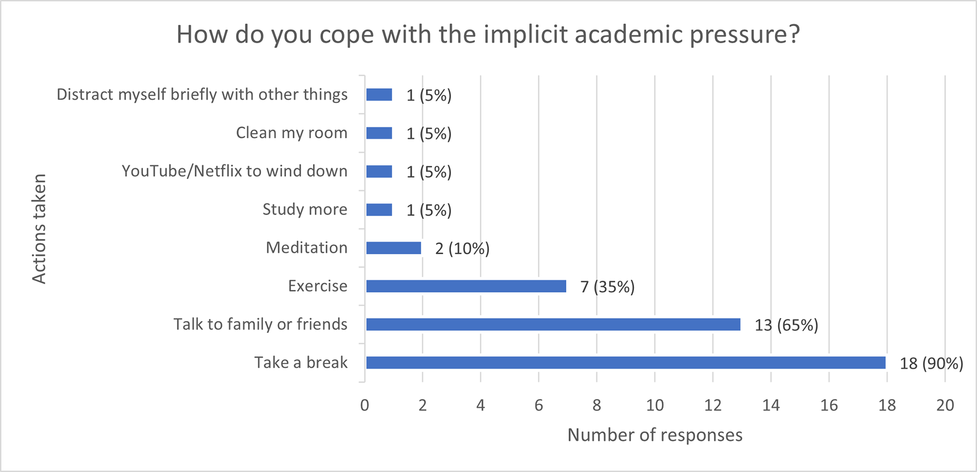
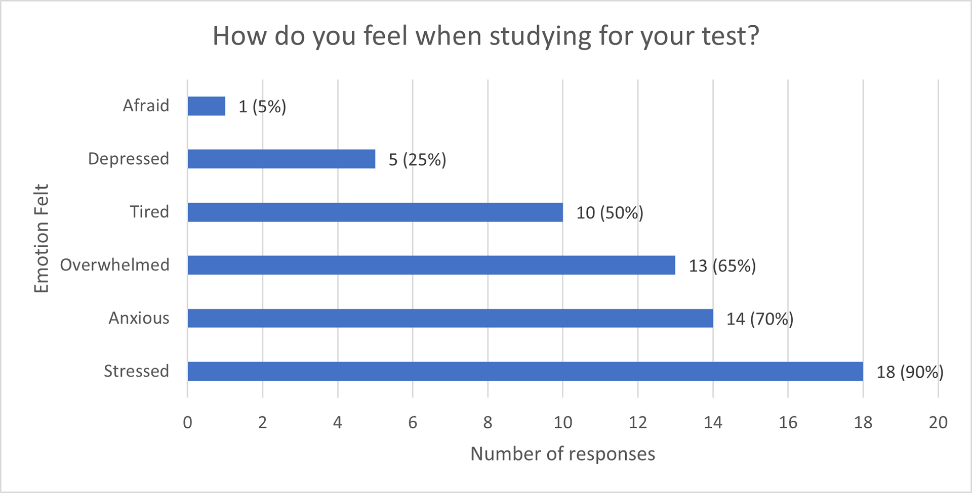
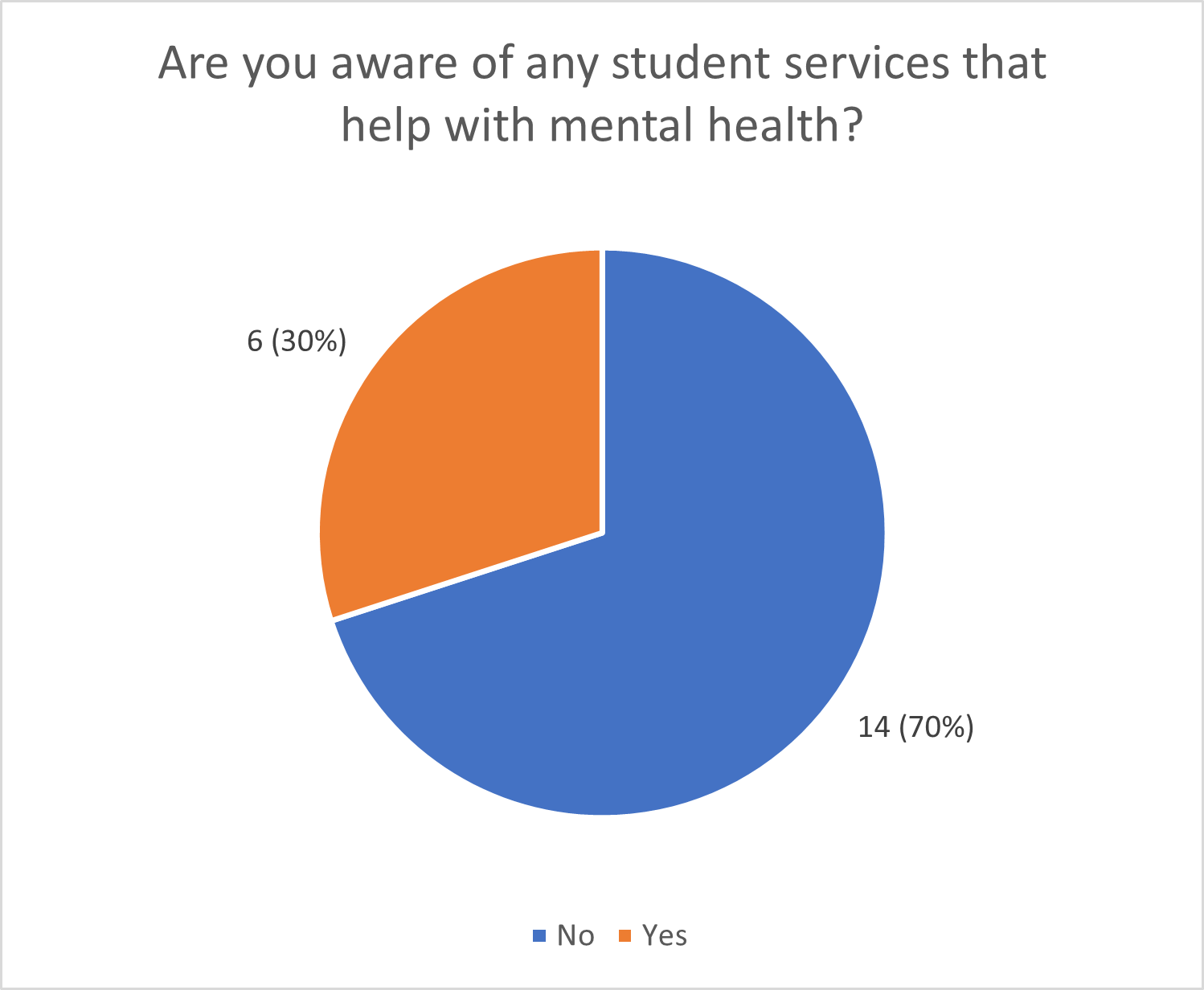
From our research, we found that current user struggles are similar to a cycle:
These point to a systemic issue as the university is indirectly contributing to a competitive culture. Students are comparing themselves to an idealized version of themselves that does not exist. And if they fail to keep up to that standard, they cope by themselves in isolation as they "shouldn't even have this problem in the first place."
Since we can’t dismantle a system and its structure, we choose to focus on other pain points in the system and its process. In this case, we focus on the seeking help process by making students be aware of other underutilized resources.
Although 29 students' opinions are nowhere enough to generalize the entire 93,000-student population, it did give us a glimpse of their perceptions on what the issues are from the student’s perspective.
User Requirements
Now that we defined which issue to solve, we need to understand what our current user needs by first defining our user and their needs. To do this, we created an empathy map and user persona based on our research findings.

Our user persona, Susan the engineering student
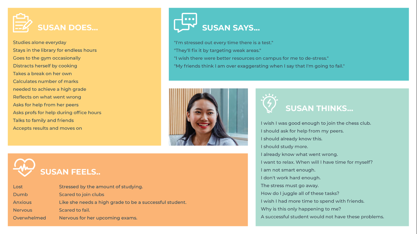
Empathy map of Susan's state as she studies for her exams
Our empathy map gives us a further view on how our user would likely experience as they’re preparing for their tests and assignments.
Our created user persona solidifies who exactly we are designing for. We chose an engineering student as it is seen as one of the “harder” programs of study. Designing for them should help the traditionally “less difficult” programs of study.
Next, we needed to examine our persona Susan the engineering student’s as-is scenario to determine where we could improve in her current journey.
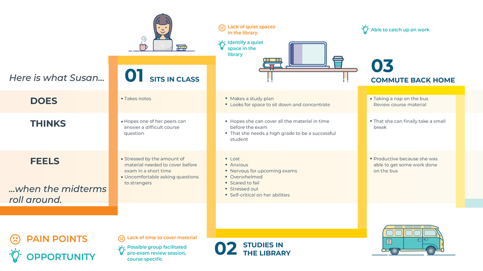
The images demonstrate Susan the engineering student’s current user experience when studying for her exams.
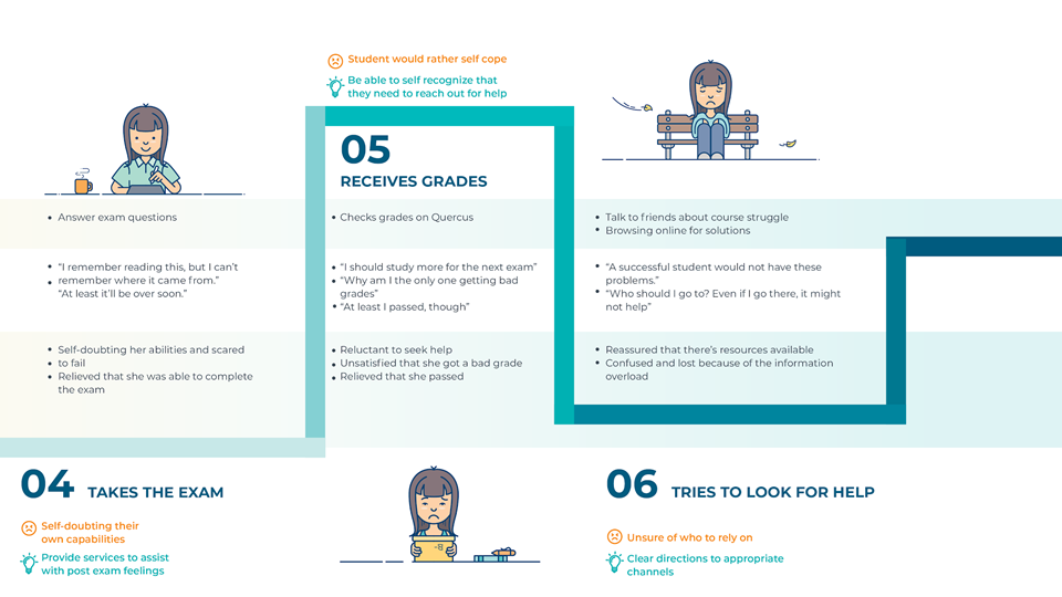
Drawing out the user journey map gives us a better viewpoint to Susan's user needs. In this as-is scenario, Susan the engineering student needs…
• A way to relieve stress so that she can perform better academically
• A way to be more social so that she can distract herself when feeling stressed
• A way to be be guided when she is feeling overwhelmed so that she can figure out the best way to to balance her academic and social life
Now that we understood Susan the engineering student’s user needs, we used it as a springboard for ideation. We generated ideas, including crazy ideas then clustered them. The combination helped us identify which general areas we want our solution to focus on, and we could incorporate suitable features from individual ideas.


Then, we prioritized our idea categories to determine which solution category would be the most feasible and impactful to Susan the engineering student's needs.
We chose the chatbot idea from the personalized service category, which is the most feasible and impactful category, to use as our solution. We felt that the chatbot app could encourage Susan the engineering student to socialize others through a welcoming community.
Now that we have the idea of a solution, we integrate it into Susan the engineering student's experience journey in a to-be scenario below. We focus on the fact that the solution is an app, which meant she could integrate it into different parts of her journey, even if no one is with her, to destress quietly.
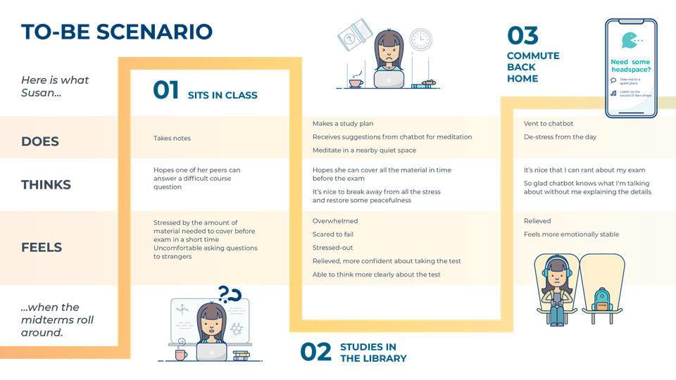
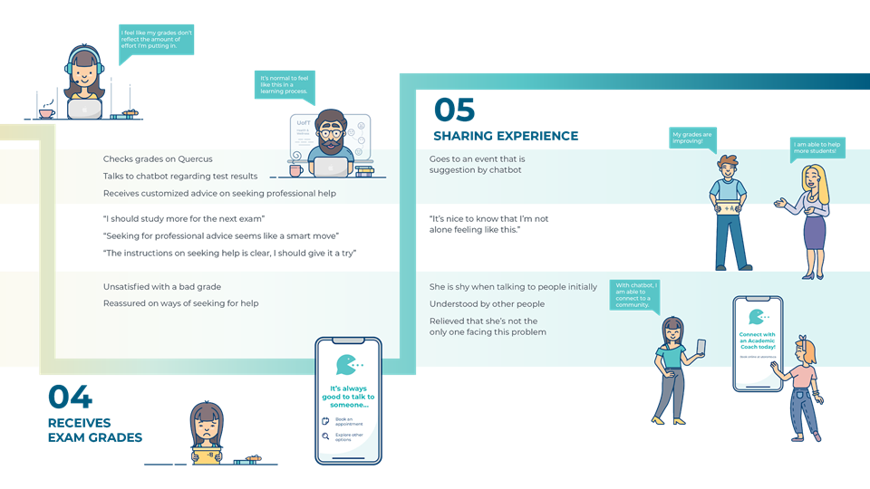
To help guide our solution, we created hill statements to define our success criteria when using our chatbot app. Below are our hill statements.
We chose these hill statements as:
1. Our first hill statement address how the chatbot allows students to vent without providing any context, which we assigned as the ‘wow’ factor. This should differentiate this app from other apps.
2. Our hills reflect the different ways how Susan utilizes the chatbot to improve her academic performance while destressing.
3. Our third hill focuses on the idea of connecting students to a larger community that can serve as a support system, a solution that students desire.
Low-Fidelity Sketches
Next, we created low fidelity sketches based on our understanding of our user needs.
Testing users with a low-fidelity prototype would draw their focus more on the type of content and user flow instead of the colours and visual branding. The app should stand on its own even without the colours and visual branding.
Usability Testing: Testing the Idea
This usability testing was an exploratory testing. We needed to flesh out the app’s interactions and conceptual problems (as opposed to comparing performance with benchmarks).
I recruited 3 users and conducted a lean usability test with them using the low-fidelity prototypes. I tested one participant in-person, and the other two remotely with a phone interview.
We had the following as our participants:
1. A first-year Master of Engineering student for his awareness of other on-campus mental health and wellbeing resources.
2. A third-year psychology student to determine if behavioural outcomes were met.
3. A fourth-year computer science student to discuss about technical limitations.
Each participant took about 30 minutes including a semi-structured interview before and after the usability test. The interviews gave context to their decisions and acceptability of the app idea.
I categorized the findings into criticisms, reasons for change, and suggested fixes.
Below is a summary of our user testing findings.
Implementing Testing Feedback We Received
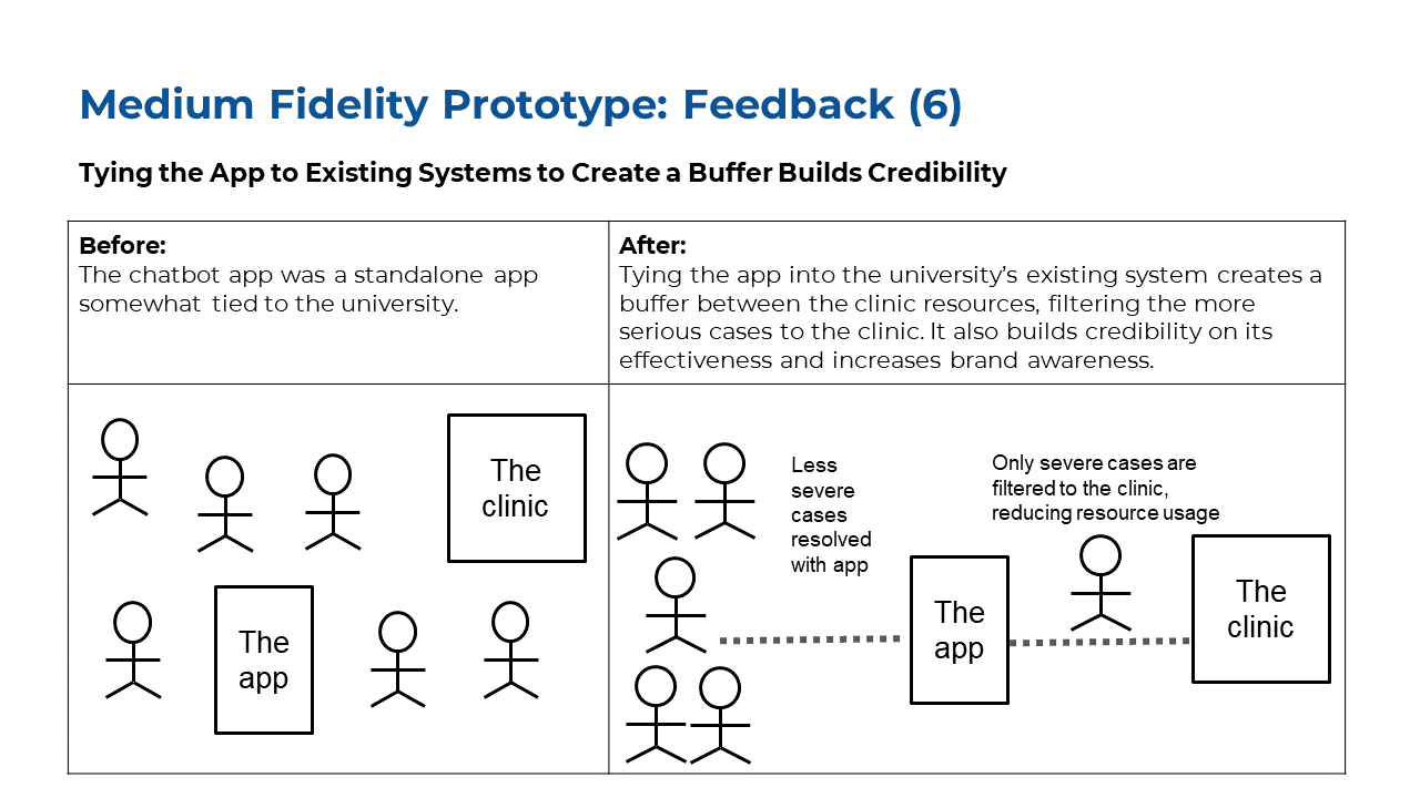
Medium Fidelity Prototypes
Next Steps for this Project
• Conduct another round of usability testing to refine the medium fidelity prototype
• Conduct a competitive usability test and analysis with comparable apps
• Consider users with pre-existing mental health conditions, and not just the ‘happy path’
• Consult with a software developer on the app’s technical implementation challenges, and discuss potential steps to implement the app
• Rework the user interface to tie the app into the university’s Health and Wellness clinics
What did I learn from this Project?
This was my first end-to-end UX project, and I’ve learned about the terms used and the overall UX design process. I also learned that:
1. That framing the problem is a lot more difficult than solving it. You can’t solve a problem if you don’t know what the problem is!
2. That we should conduct a competitive analysis early on to learn and improve on finished products.
3. Recognize that some users will never adopt your product.
4. That market positioning and branding can help a product by tying it into a cohesive user experience, influencing a user’s perception on a product.